The Best Layout for Your Event
Choosing the best layout for your event can play a huge part in the success of your event. Often overlooked, your layout needs to be arranged in the most effective way to get the best result.
Below is a list of several seating arrangements and layouts you can choose from, to help you decide which will be the most suitable for your event.
Theatre Style:
Here chairs are aligned in straight rows, and this is the most simple layout. With this arrangement you can get the maximum amount of space out of the room, and it is good for presentations, and informational events such as product launches and AGMs, as everyone is facing the same direction. It can however be difficult for some attendees to get in and out if their seat is in the middle of the row, and is also difficult for note taking, eating and there will be no interaction between attendees.
Classroom:
This is like a school or lecture theatre setting, with chairs and tables aligned in rows. Again, they are all facing the front of the room so presentations are easy to see, however this time attendees can take notes and even have food or coffee. This layout is great for training sessions and conferences, but it does however reduce your overall seating capacity and doesn’t really allow for interaction.
A herringbone layout is very similar, except the tables are angled.
U Shape:
The audience here faces inwards with the chairs and tables shaped as the letter U. With this layout, interaction between attendees is possible as well as interaction between the presenter/trainer with attendees. This layout is ideal for meetings, trainings and workshops, however capacity can again be reduced with the poor use of floor space, and some attendees may have a reduced visibility. The same goes for a horse shoe shape, which is simply curved.
Hollow Square
Here all four sides of attendees face inwards. This setup is great for discussions and allows for note taking and eating, however be aware that if you want a focal point for a presentation, this will not work.
Boardroom:
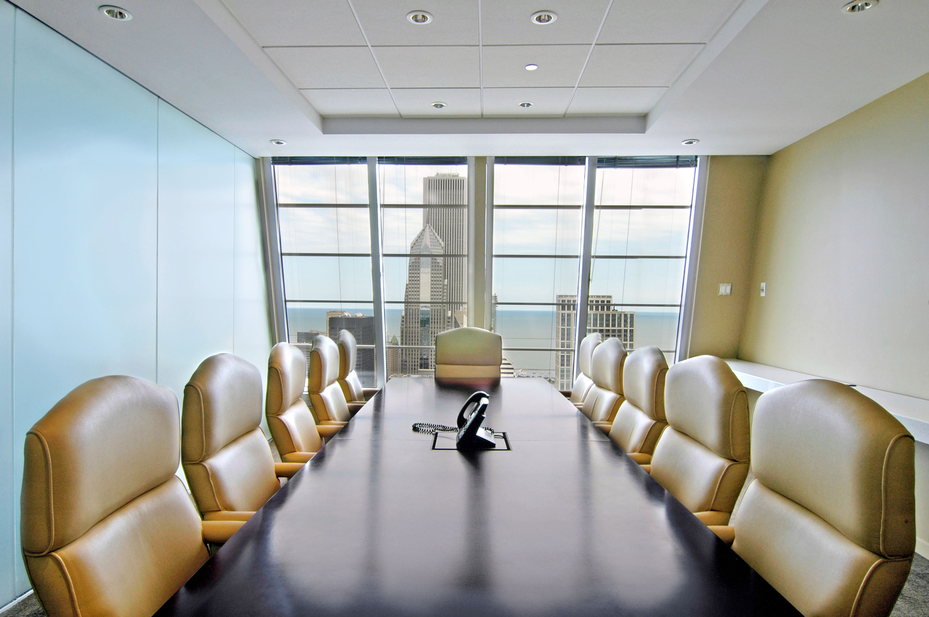
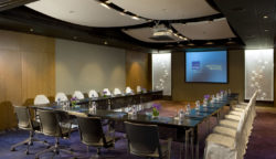
Everyone is facing inwards at a large rectangular table. This enables interaction and is perfect for small meetings and team briefings.
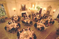
Banquet:
There are round dinner tables with attendees all sat around it. Small tables, especially if they are all booked together, allows for great interaction, but may sometimes be difficult to get in and out of if they are closed in. This layout is great for parties, awards and gala dinners. Cabaret style is similar, however to allow everyone to see a stage or focal area, the chairs are in an arc.
Cocktail:
This is the easiest arrangement as there are no chairs! Perfect for weddings, parties or even mixers in between presentations, this allows attendees to mingle. If you want to eat, sit or rest however, you may be in trouble….
Sometimes it is obvious which layout you need to use, however sometimes you need to think through what will help you achieve maximum impact for your event. For some tips on creating your own seating plan, please click here.
